
.png)
Layout components
Create responsive, structured application screens with Bellini’s layout components. Use boxes, grids, stacks, panels, slides, accordions, and fragments to organize content and control how interfaces behave.
Bellini gives developers flexible layout tools for building application pages that are clear, usable, and adaptable across different screen sizes.

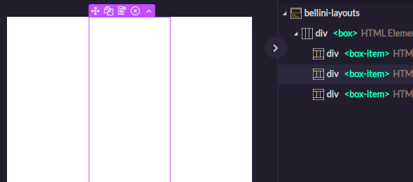
Horizontal box layout
Arrange components in a horizontal row. Use horizontal box layouts to align items side by side, control spacing, and create responsive sections that adapt as the available space changes.

Vertical box layout
Stack components vertically to create forms, panels, sections, and page flows. Use vertical box layouts to organize content from top to bottom with clear structure and spacing.
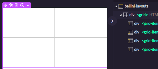
Grid layout
Organize content into rows and columns. Use grid layouts to build dashboards, detail screens, responsive pages, and interfaces that need precise alignment.

Stack layout
Place multiple layers in the same area and control which layer is shown. Use stack layouts for tabbed content, conditional views, multi-state sections, and interfaces that change based on context.

Accordion
Group content into expandable and collapsible sections. Use accordions to keep complex pages easier to scan while still giving users access to the details they need.
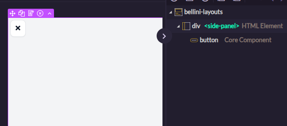
Side panel layout
Show supporting content in a side panel. Use side panels for details, filters, navigation, settings, or secondary workflows without taking users away from the current page.

Slide layout
Organize content into slides that users can move through one step at a time. Use slide layouts for guided flows, onboarding, wizards, presentations, or step-by-step processes.
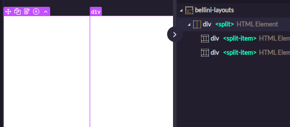
Split pane layout
Create resizable areas within a page. Use split panes when users need to compare content, view master-detail screens, or adjust how much space each section uses.

Layout fragments
Build reusable layout sections that can be placed inside other components or pages. Use layout fragments to create flexible, reusable structures while keeping fallback content available when needed.