
.png)
Visual UI design
Design application interfaces visually with Bellini. Drag components onto a canvas, configure their properties, style the interface, bind data, and preview how each page will work.
Bellini gives developers a faster way to build user interfaces while keeping the structure, behavior, and code behind the application accessible.


Drag-and-drop UI design
Build pages by placing components, layouts, and elements onto a visual canvas. Create application screens faster without manually writing every part of the interface from scratch.
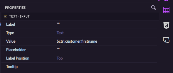
Properties view
Configure selected components, pages, layouts, and elements using the Properties view. Adjust behavior, values, bindings, visibility, and other settings from one place.
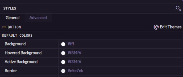
Styles view
Control how the selected element looks using the Styles view. Adjust styling visually while still keeping the flexibility to use CSS when deeper control is required.

Responsive layouts
Create interfaces that adapt to different screen sizes and application needs. Use layout components and configuration options to design pages that work across desktop, tablet, and mobile experiences.
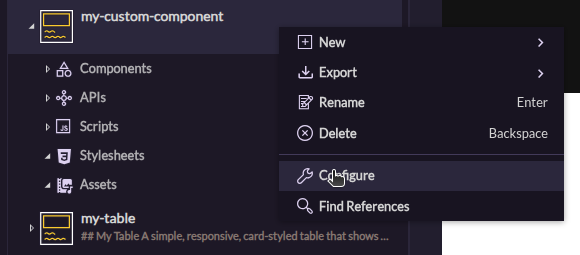
Component configuration
Customize components using their available settings. Configure labels, values, events, data sources, visibility, validation, and other behavior without leaving the editor.

One-way and two-way binding
Bind component properties to data, expressions, functions, services, and APIs. Use one-way binding to display changing data, or two-way binding when the UI and underlying value both need to stay in sync.

Content assist
Use content assist while configuring expressions, functions, and bindings. Get help referencing available values, services, APIs, and component properties so development stays fast and accurate.
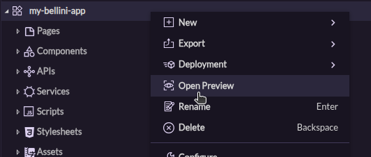
Live preview
Preview pages as you build them. Check layout, styling, data binding, and component behavior before publishing the application.